
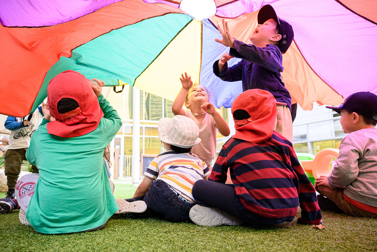
Colour photography can be used creatively to influence how an image is perceived. When used intentionally colour can direct viewers attention and emotional response. This is subjective and dependent on the language of photography.
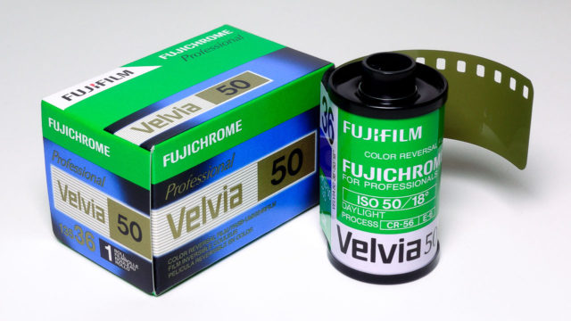
The accuracy of colour reproduction is objective and can be measured. When professional photographers used film we would look at many factors on how it reproduced colour for our clients. An organic process film was manufactured in batches and professional film had batch numbers. As colour, contrast and sensitivity would vary from batch to batch photographers would purchase large volumes, test it and make adjustments with theirs cameras and filters.
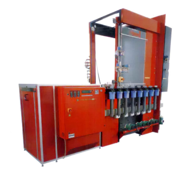
Film is processed in chemicals and that too varied and was manufactured in batches. Film labs also had variables depending their machinery that regulated time and temperature and the condition of the chemistry. Labs processed test strips several times a day then measured them with densitometers and make adjustments.
All these variables I remember had maybe a 10% tolerance for margin of error. When you add cameras, metering, film manufacturing, chemicals, labs and human error it could in theory equal 100% inaccuracy. However I never saw results that extreme. The photographer’s choice of colour film had more impact.

International standards were established to measure and control colour film reproduction. Photography is one of the oldest ISO Committees. I’ve always been pedantic when it comes to standards. The early days of digital colour photography was a wild west and clients were receiving some images that looked over-Photoshopped. Professional associations pooled their resources to create guides for photographers and clients. The Australian Photographic Digital Imaging Guidelines (APDIG) were released in 2004 and the Universal Photographic Digital Imaging Guidelines (UPDIG) soon after.
Colour Management
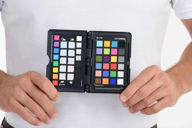
A color managed workflow is essential to deliver images to clients with the most accurate colour possible. Calibrating all parts of the photography workflow from capture to output ensures images are rendered the way the photographer intended.
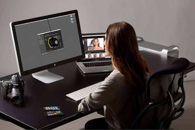
Calibration means using a hardware device and software to measure cameras, monitors and printers to generate an ICC profile. Profiles are like a thumbprint of how a device renders colour then translates it for another device such as a monitor or printer.
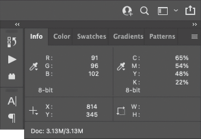
Before Photoshop 5 photographers were using numbers on the Info panel to check colour, contrast and brightness of images. With this new version photographers could make adjustments to images on a calibrated monitor trusting what they saw was accurate and far more intuitive.
Photographers will deliver images in a particular color space. Typically sRGB or Adobe RGB (1998). sRGB is a lowest common denominator to avoid colours looking inaccurate. Cameras, monitors, printers, minilabs and web browsers use it by default.
Adobe RGB (1998) provides more colour information but with more power comes more responsibility. Viewing an image in this color space on an uncalibrated monitor would look flat and desaturated, especially on the web. The benefit of Adobe RGB (1998) provides you more options for repurposing, especially preparing images for offset printing.
Colour accuracy is but a means to an end. I aim for a colour accurate image then get creative from there.